Design and engineering
The design system behind this site
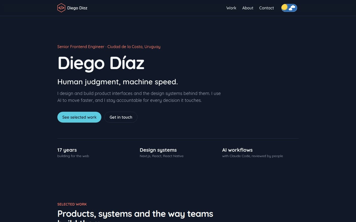
Tokens, accessible components and motion in a monorepo, documented in Storybook and tested on every story. Built faster with AI, with every change reviewed.
- Design tokens
- Storybook
- WCAG 2.2
- Motion
- Monorepo
- Role
- Design and engineering
- Stack
- Next.js, Tailwind CSS v4, Motion, Storybook, Turborepo
- Standard
- WCAG 2.2 AA
- axe violations in light and dark
- 0
- contrast for text and UI tokens
- AA
- of stories run as tests
- 100%
On this page
Starting point
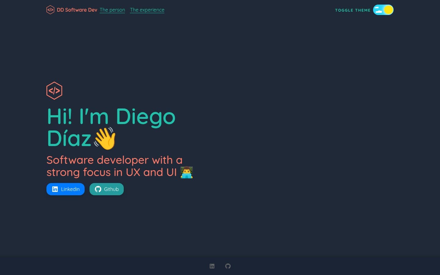
My old site rendered nothing on the server until the theme was known, scrolled inside a div instead of the page, and used buttons where links belonged. It looked fine and worked badly with a keyboard, a screen reader or a search engine.
Structure
A monorepo keeps the design system apart from the app. The site can only use what the system exports, so anything that depends on Next.js shows up right away. The system is framework agnostic, which is the first step to publishing it as an SDK.
- Semantic color tokens, each pair checked for contrast: at least 4.5 to 1 for text and 3 to 1 for UI in both themes.
- One class merge helper that knows those tokens, so styles passed from outside never fight the defaults.
- Component CSS lives in a lower cascade layer, so utility classes always win.
Motion with a conscience
The header underline glides between sections using one shared element, and the day and night switch animates with springs. Both respect reduced motion: the animation is replaced, not just slowed down.
Caught in testing
The decision
Quality built in
- Every story in Storybook runs as a test: it renders, runs its interaction script and passes an axe audit.
- Keyboard first: skip link, visible focus, real links, and a table of contents you can use without a mouse.
- Content is rendered on the server, and entry animations are pure CSS, so nothing is hidden waiting for JavaScript.
How AI fits in
The new home page carries far more than the old one: case studies, a timeline and a design system behind it. The first Lighthouse run cost it on mobile: 82 against 91. Loading the animation engine after first paint and letting the main heading appear without a fade brought it to the same speed as the old page, while accessibility went from 96 to 100.
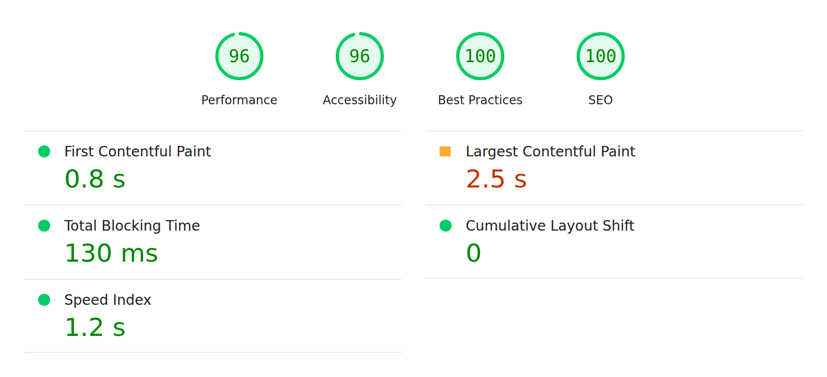
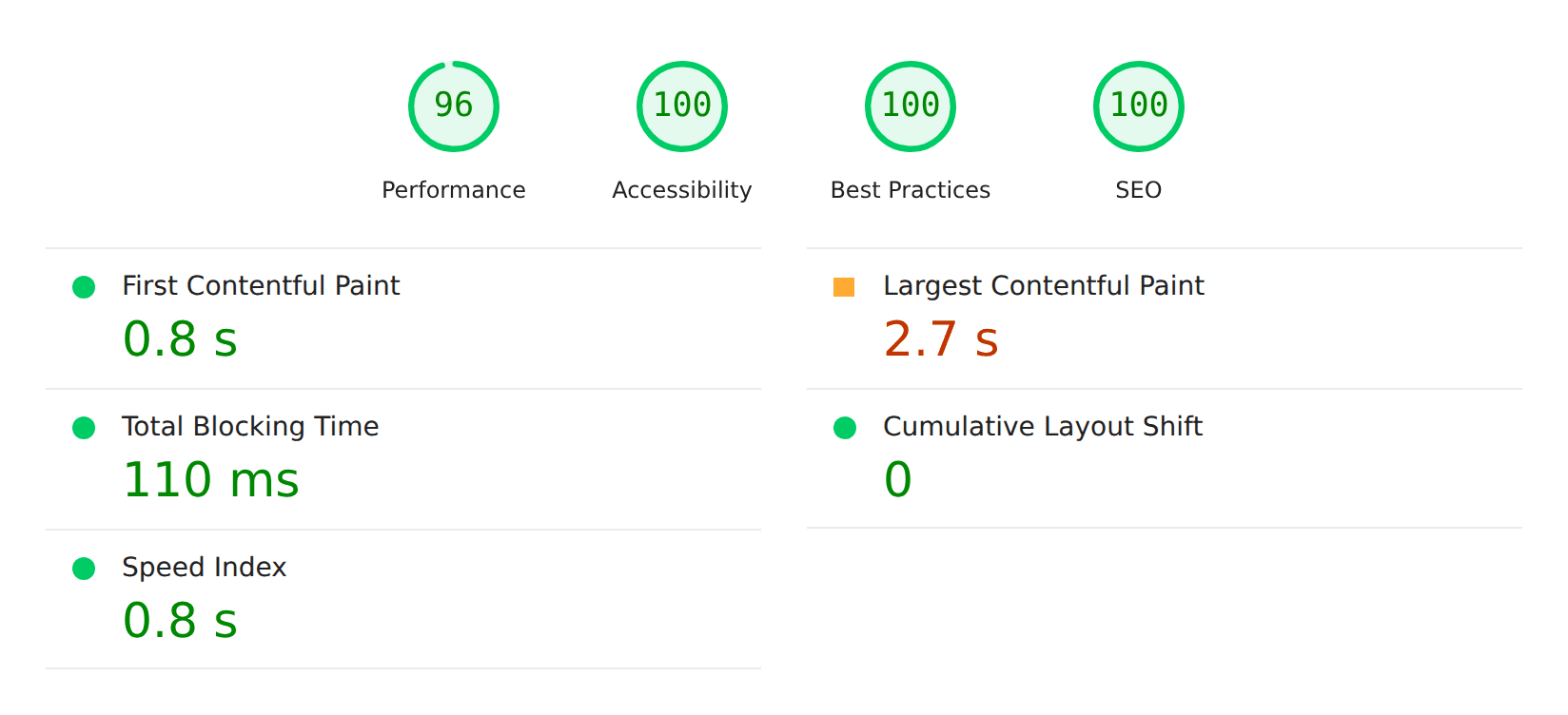
One number stays borderline on both sites: Largest Contentful Paint, around 2.5 seconds. In a real browser the heading paints together with the rest of the first screen, about 0.2 seconds after the request. Lighthouse simulates a slow phone and adds every script that started downloading before that paint, around 200 KB of React and Next.js, even though none of them hold the heading back.
Before accepting that, I tested the usual fixes, five mobile runs each.
| Change | LCP | Performance | Trade-off |
|---|---|---|---|
| Current code | 2.25 s | 97 | None |
| Font shown without a fallback swap | 2.2 s | 98 | A first visit can show the fallback font |
| Critical CSS inlined in the page | 2.27 s | 95 | Heavier HTML on every page |
| Animation engine loaded when the browser is idle | 2.2 s | 97 | Animations can start later |
The decision: judge it with real visitors
Next case study
People log good deeds they did or witnessed, and together they fill an anonymous heatmap. Web and mobile share one design system, and Claude Haiku checks each submission before it goes live.