Personal project · Design and engineering
Ramps: a design system study
A study of Ramp’s design system and Bill Pay app, rebuilt from their public product videos with a Claude Code skill I wrote: 40 components and nearly 200 stories in Storybook, plus a working demo backed by Supabase.
- Design systems
- Storybook
- Next.js
- Supabase
- Claude Code
Personal study. Not affiliated with Ramp.
- Role
- Design and engineering
- Stack
- Next.js, Storybook, Supabase, Vercel
- Method
- Frames and captions from public videos, tokens from public CSS
- components
- 40
- stories in Storybook
- 199
- between video frames
- 10 s
On this page
Why this study
I wanted to test a question behind my whole positioning: how far can one person get reproducing a mature product design system when AI does the heavy watching and a person does the judging?
I picked Ramp for its product design, which I consider a benchmark.
Watching videos like a designer
I wrote a Claude Code skill, watch-youtube, that downloads a video, saves a frame every 10 seconds and reads the captions. Frames and captions are stored next to the research as documentation, so every visual claim points to a snapshot.
- First pass: uniform frames to map the whole walkthrough.
- Second pass: extra frames at the moments that matter, like a drawer opening or a state change.
- A link with a timestamp skips all that and grabs just that frame.
For exact values, I read the design tokens from the CSS of Ramp’s public login page: colors, type, radii and spacing.
Where AI helped
The decision
The system
Foundations for palette, status tones, radii, elevation, spacing and typography, and 40 components documented with nearly 200 stories.
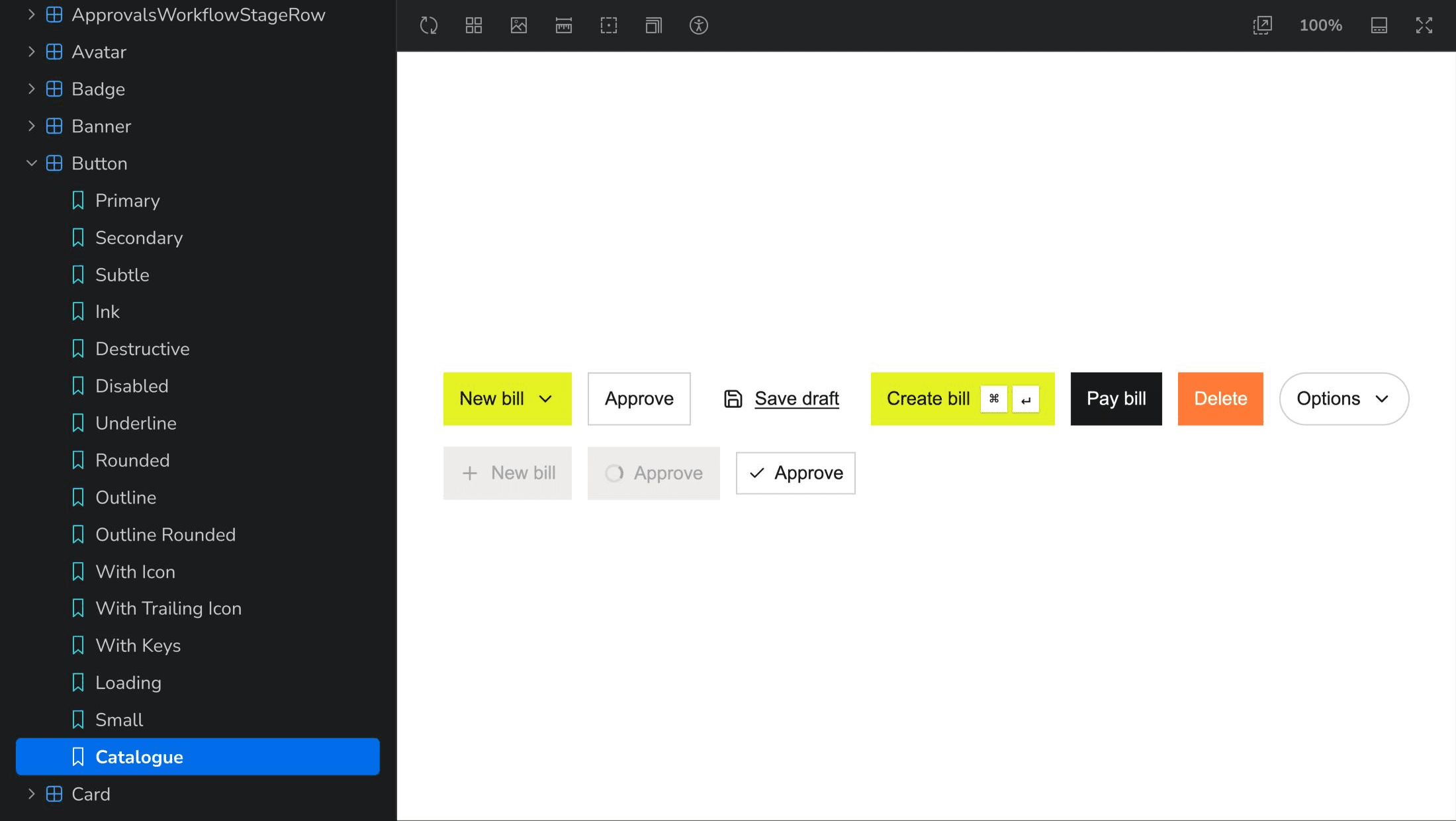
- Complex pieces like an approvals workflow editor, a command palette and a draggable detail panel.
- A data table with sticky columns, cross-page selection and pinned pagination.
- The small things that make it feel real: toasts in nine positions, money formatting per locale, progress bars that do not flash on fast work.
A working demo
The components come together in an accounts payable demo with a real Supabase backend, deployed on Vercel.
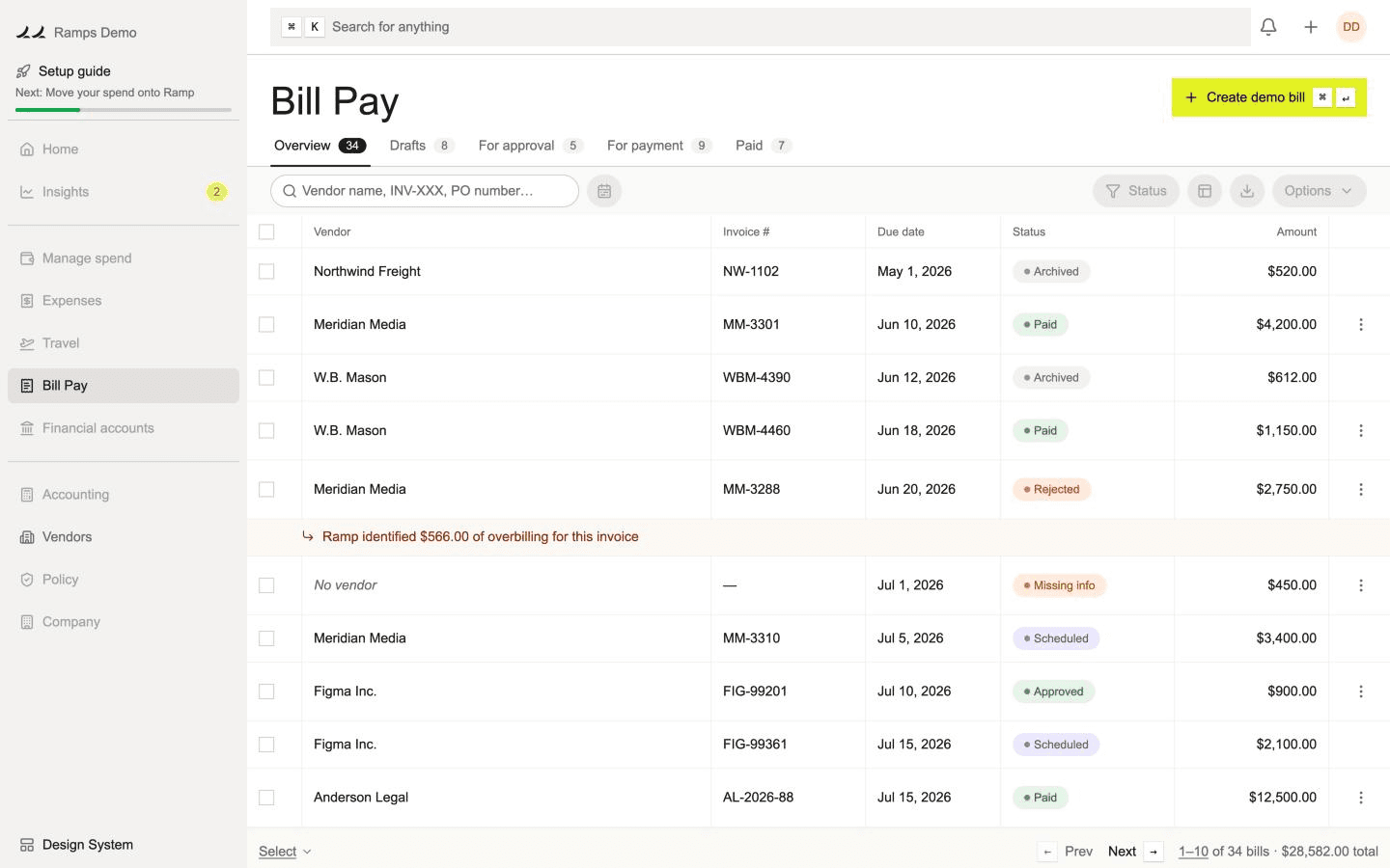
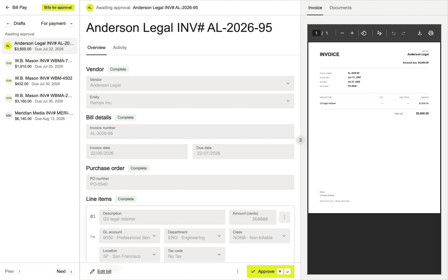
The MVP took a week, plus two more days to polish the microinteractions.
The decision: rethinking the workflow
Next case study
The design system behind this site
Tokens, accessible components and motion in a monorepo, documented in Storybook and tested on every story. Built faster with AI, with every change reviewed.